How to Optimize Your Shopify Store for Mobile: The Ultimate Guide
It’s no surprise that in 2025 Mobile commerce is booming. In fact, more than 81% of traffic to Shopify stores comes from mobile devices and in 2025 over half of all ecommerce purchases will be made on mobile. This comprehensive guide will help Shopify store owners, marketers, and developers optimize their stores for mobile users. We’ll cover responsive design, page speed tweaks, UX best practices and more. We’ll also explore how leveraging a mobile app (like Venn Apps) can take your mobile experience to the next level and boost conversions. Let’s dive in!
Author:
Josh Gare
Publish date:
16th April 2025
10 min read

What is Mobile Optimization for Shopify?
Mobile Optimization for Shopify is the process of enhancing your store's mobile experience to ensure fast load times, intuitive navigation, and a seamless shopping journey for phone users. In an era where mobile commerce is as prevalent as desktop shopping, it’s an absolutely essential part of building a thriving eCommerce store.
Why Mobile Optimization Matters
Mobile usage now dominates online shopping. Mobile commerce represents nearly 45% of ecommerce sales in the US as of 2024, and users spend hours each day on smartphones.
If your Shopify store doesn’t work seamlessly on mobile, you’re likely losing a huge chunk of potential customers. Moreover, Google prioritizes mobile-friendly sites in search rankings, meaning an unoptimized mobile site can hurt your SEO and visibility.
Consider these facts: 53% of mobile users will abandon a site that takes longer than 3 seconds to load. And those who do stay are less likely to convert if the site is hard to navigate or read on a small screen.
A poorly optimized mobile store isn’t just frustrating for users – it can also be “invisible” to search engines. The bottom line is clear: optimize for mobile or get left behind in today’s commerce landscape. In the sections below, we’ll cover exactly how to do that.
1. Responsive Themes and Design

Responsive design is the foundation of mobile optimization. A responsive Shopify theme automatically adjusts the layout, images, and functionality of your store to fit any screen size.
The good news is that Shopify’s platform has responsive design built-in, and most Shopify themes are mobile-responsive by default. However, it’s still crucial to choose a modern, mobile-first theme and to test your design on actual devices.
- Choose a Mobile-Optimized Theme: If you’re selecting a theme, make sure it’s advertised as responsive or “mobile-first.” Shopify’s Theme Store highlights themes optimized for mobile experience.
- Preview and Test on Devices: Even with a responsive theme, always preview your store on multiple screen sizes. Use the Shopify theme customiser’s device preview to see how your site looks on mobile and tablet. Then, test on a real phone.
- Ensure Consistent Content: With responsive design, you maintain one set of content for all devices. This is good for SEO and maintenance. Just be cautious that any custom code or apps you add are also mobile-friendly & all links and navigation lead to the same URLs on mobile and desktop.
- Use Accordions for Long Content: Mobile screens have limited space, so for sections like product descriptions, FAQs, or additional info, use accordion sections (expandable/collapsible content) to keep the page concise.

By adopting a responsive, mobile-first approach, you ensure your Shopify store adapts to any device. You shouldn’t need a separate mobile site or custom mobile domain – one responsive site is easier to maintain and is favoured by search engines.
2. Simplified Navigation for Mobile Users

Navigation can make or break the mobile user experience. On a desktop site, you might have an expansive menu with multiple levels, but on mobile, screen space is limited. The goal is to provide an easy, intuitive way for users to find what they need without overwhelming them.
- Use a Hamburger Menu: Most Shopify themes automatically collapse the main menu into a “☰” hamburger icon on mobile. This is a common pattern that saves space. This approach allows you to offer a wide range of navigation options without cluttering the screen.
- Keep Menu Options Focused: Simplify your menu for mobile. Include only the most important categories or pages in the primary navigation. If you have many sub-categories, group them under broad headings using dropdowns or accordions within the menu.
- Sticky Navigation or Icons: Consider making certain navigation elements always accessible. For example, many mobile sites keep a sticky header bar with a back button, logo, search icon, and cart icon visible as you scroll. This ensures users can quickly search or view their cart at any time.
- Prominent Search: Mobile shoppers often use search to quickly find products (especially on stores with large catalogs). Make sure the search function is easy to find – usually an icon in the header. A good search reduces the need for deep navigation and helps users get straight to the product they want.
- Distinct Mobile Menu: Some Shopify themes let you configure a separate menu for mobile vs desktop. If your desktop menu has a lot of links, you might create a pared-down mobile menu in your Shopify navigation settings and assign it to the mobile view in your theme customiser. This way, you can hide or combine less crucial links on mobile.
By streamlining navigation, you keep mobile visitors engaged longer and reduce frustration. Simplified, clear navigation helps shoppers quickly find what they’re looking for – which directly contributes to higher conversion rates.
3. Optimizing Images and Media for Mobile

Images and videos need special attention for mobile optimization. On smaller screens, you must balance visual appeal with performance. High-quality media is important for showcasing products, but you have to ensure it doesn’t slow down or break the mobile layout.
- Use Responsive Images: Make sure images scale down on smaller screens so they’re not spilling off the side or requiring horizontal scroll. Shopify’s responsive themes automatically make images fluid (using CSS max-width: 100%), but if you have any fixed-width images, adjust them.
- Optimize Video Usage: Videos can engage customers, but they can also be heavy. If you use backgroundor product videos make sure to host them on YouTube or Vimeo and embed, so they stream efficiently. These platforms also adapt the stream quality to the user’s connection. If using Shopify’s video section, ensure the video file is sufficiently compressed.
- Image Dimensions and Quality: Follow the guideline of around 200 KB per image on average as a reasonable target for mobile pages. Some images, like banners, might be a bit larger, but many product thumbnail images can be well under 100 KB with good compression. Set explicit width and height attributes on images in your HTML or Liquid where possible – this helps browsers allocate the right space and avoid layout shifts (which improves Core Web Vitals metrics like CLS).
- Center and Crop Wisely: Pay attention to how images crop on mobile. For example, a wide banner image might crop the sides on a tall mobile screen. Ensure the focal point of the image (such as the product or text) remains visible on mobile.
- Lazy Load Below-Fold Media: Lazy loading is crucial for media. This includes not just images but also iframe embeds (like YouTube videos or Instagram feeds). Only load heavy media when the user is likely to see it. This might mean placing video embeds lower on the page, or using a placeholder that loads the video on demand.
By optimizing images and media for mobile, you maintain a visually rich store without sacrificing speed or usability. Crisp, fast-loading images make your store look professional and keep customers engaged. Since visuals are key in e-commerce, the goal is to deliver beautiful images in the most efficient way possible. This means using the right formats, sizes, and loading techniques tuned for mobile devices.
4. Mobile UX/UI Best Practices
Designing a great mobile user experience goes beyond responsiveness and speed. It’s about making your site easy to use on a small touchscreen. This involves touch-friendly elements, readable text, and a layout that guides users toward taking action (like making a purchase). Below are some UX/UI best practices to ensure your Shopify store not only works on mobile, but truly delights mobile shoppers.
Touch-Friendly Buttons and CTAs
On mobile, every link or button is tapped with a finger, not clicked with a precise mouse pointer. That means your interactive elements need to be larger and well spaced.
- Use Large, Tappable Buttons: As a rule of thumb, make sure buttons are at least about 44px in height (Apple’s guideline for tap target size). The “Add to Cart” or “Buy Now” button on product pages should span almost the full width of the screen on mobile and be prominent.
- Spacing Between Elements: Always leave enough space between tappable elements (links, buttons, icons) so that users don’t accidentally hit the wrong one. Crowded links lead to frustration on mobile.
- Sticky Add to Cart Bar: A powerful tactic on product pages is a sticky Add to Cart bar that remains at the bottom of the screen as the user scrolls. This way, after a user reads the description or reviews, they don’t have to scroll back up to find the Add to Cart button – it’s always right there, one tap away.
- Thumb-Friendly Placement: Place important buttons where they are easy to reach. On mobile, the bottom center or bottom right of the screen is often easiest for thumb reach (for right-handed users, bottom right is prime). That’s why you often see floating action buttons or chat icons at bottom right.

Readable Fonts and Text
Reading on a small screen can strain the eyes if not optimized. Your typography and text layout should maximise legibility.
- Adequate Font Size: Make sure your base font size is large enough (recommended ~16px) for body text. This ensures most users can read without zooming.
- Use Mobile-Friendly Fonts: Stick to clean, sans-serif fonts which tend to be more readable on screens. Cursive fonts can be illegible on a phone. If your brand font is decorative, consider using it in logos or headers sparingly, and use a simpler font for body text on mobile.
- Contrast and Colors: Ensure there is high contrast between text and background (dark text on a light background or vice versa). Mobile screens are often viewed in less-than-ideal conditions (outdoor glare, night mode, etc.), so strong contrast helps all users, including those with low vision or in bright light.
- Content Hierarchy: Put the most important information first. For example, on a product page, the product name, price, and CTA should appear before the detailed description or lengthy reviews (which can be further down or collapsed). Use headings to organize content so a user can quickly jump to sections of interest (specifications, reviews, etc.) without getting lost.

Streamlined Checkout and Forms
The checkout process is where the money is made – but on mobile, it’s also where many carts are abandoned if the experience is cumbersome. Shopify’s native checkout is mobile-optimized, but you can still take steps to streamline it further:
- Use Shopify’s Accelerated Checkouts: Enable payment options like Shop Pay, Apple Pay, Google Pay, PayPal etc. These mobile wallets allow one-tap checkout by using stored information.
- Minimal Checkout Steps: Shopify by default has a multi-step checkout (Contact, Shipping, Payment). You can’t reduce these core steps, but ensure you’re not adding any additional required fields. For instance, don’t require a company name or second address line if not needed. If you have Shopify Plus, you might customize the checkout to remove fields.
- Guest Checkout vs. Accounts: For mobile especially, allow guest checkout. Forcing account creation is a major friction point. Let users check out first, then offer account creation afterwards.
- Simplify Mobile Forms: Beyond checkout, any form (newsletter signup, contact, etc.) should be kept short and simple for mobile users. The general rule: ask only what you need. Each extra field is an opportunity for the user to give up.

By smoothing out the checkout flow on mobile, you reduce cart abandonment and increase your conversion rate. A fast, easy checkout is often the difference between a sale and an abandoned cart, especially on mobile where user patience is low.
5. Mobile SEO Considerations
Optimizing for mobile isn’t just about UX – it’s also about ensuring search engines can effectively crawl and rank your mobile content. Google’s move to mobile-first indexing means the mobile version of your site is primarily what counts for SEO.

Thankfully, if you’ve followed the steps above, you’ve covered a lot of SEO ground (responsive design, fast speed, etc. are all SEO boosters). Here are additional mobile-specific SEO tips:
- Ensure All Content is Accessible on Mobile: Sometimes, mobile versions hide certain content for design reasons. Be cautious: if you hide a lot of content on mobile, Google might not index that content. It’s fine to use accordions or tabs, but avoid completely leaving out important text or links on the mobile version.
- Page Speed and Core Web Vitals: Google’s Core Web Vitals (LCP, FID, CLS) heavily affect SEO now, especially on mobile. Use Search Console’s Core Web Vitals report to see how your mobile pages perform.
- Mobile Metadata: Craft your titles and meta descriptions with mobile in mind. Google will show the same title in mobile results, but keep them punchy – mobile screens might show slightly fewer characters. More importantly, an enticing meta description that highlights mobile-specific perks (like “Shop on the go” or “Fast mobile checkout with Apple Pay”) could improve click-through from mobile users.
- Monitor Mobile Performance in Google Search Console: GSC will report mobile usability issues (like clickable elements too close, text too small) – many of which we addressed in UX. Keep an eye on that report and fix any flagged issues. Also check the Mobile-Friendly Test for key pages.
If your site is fast, responsive, and provides a good user experience, you’re likely hitting the key mobile SEO notes. The additional step is to continuously monitor and tweak for mobile-specific issues. Search engines want to provide searchers with results that deliver great experiences on their phones, so by following the steps in this guide, you’re not only pleasing your visitors but also the Google gods
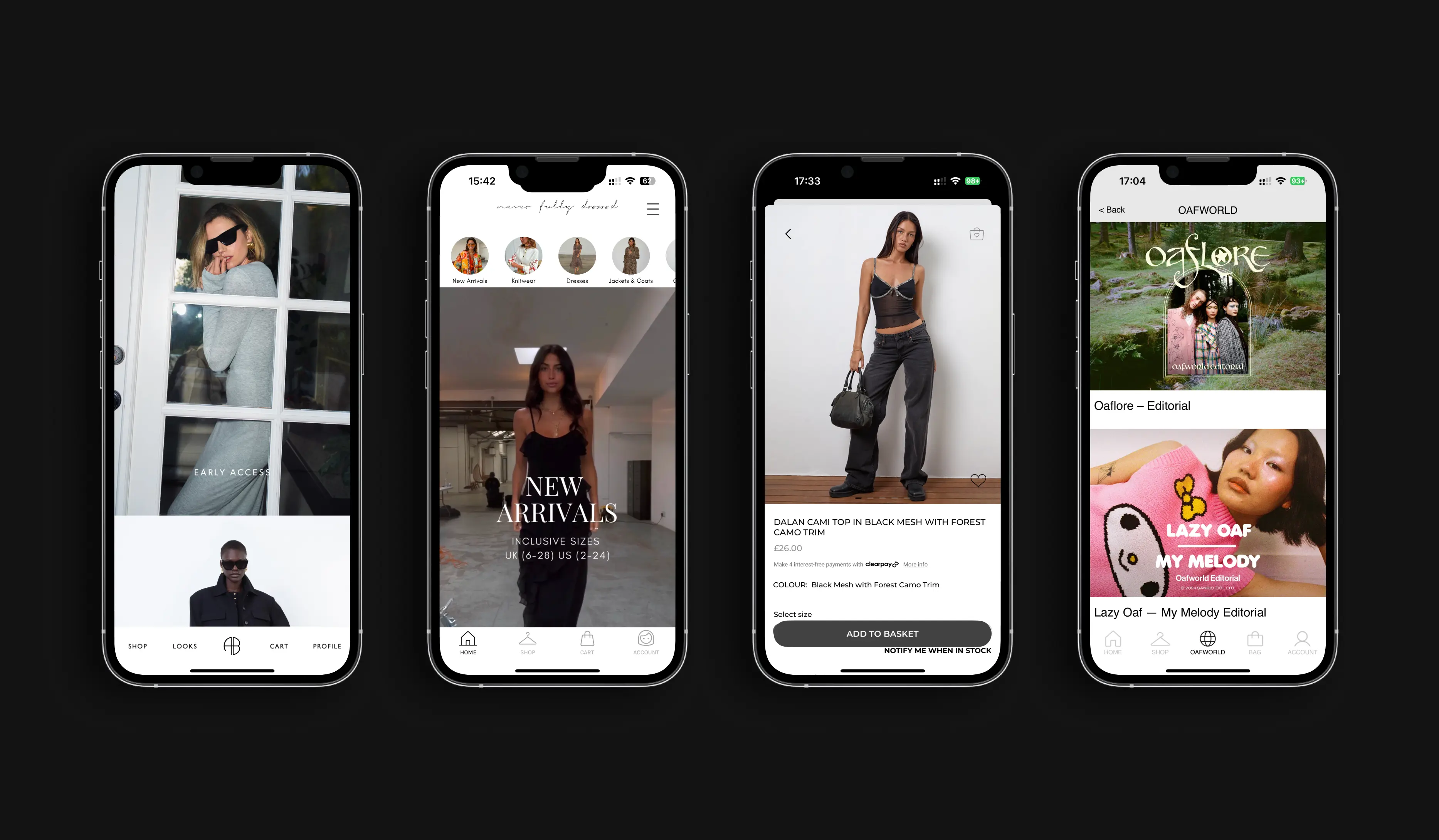
6. Leverage Mobile Apps for an Enhanced Experience (Beyond the Mobile Web)

While a mobile-optimized website is vital, top Shopify merchants are increasingly complementing it with mobile apps to engage their loyal customers. A native mobile app can provide an even faster and more personalided shopping experience than a mobile browser. Solutions like Venn Apps allow you to convert your Shopify store into a native app for iOS and Android, unlocking new channels for conversion and engagement. Here’s why a mobile app can be a strategic advantage:
- Higher Conversion Rates and Order Value: Native apps often convert better than mobile websites. In fact, on average mobile app users spend 20% more per order and convert 2× higher than mobile website usersApps make checkout smoother (stored payment info, etc.) and browsing faster, which encourages more purchasing.
- Increased Customer Loyalty: When customers download your app, they’re effectively raising their hand as loyal fans. Apps can boost Customer Lifetime Value (CLTV) by up to 3× by making repeat purchases easier and keeping your brand on their home screenFeatures like saved wishlists, personalised push notifications, and loyalty program integration in-app all encourage more frequent engagement.
- Better Performance & UX: A well-built app offers faster load times and smoother navigation than a web page, since assets can be cached on the device and interactions feel more fluid. There’s no browser interface to deal with, and you can design the app UI tailored exactly to mobile usage patterns. The result is a seamless shopping experience that can outperform even the best mobile-optimized website.
- Push Notifications = Free Re-Engagement: Perhaps one of the biggest advantages, apps let you send unlimited push notifications directly to users’ device. This is a powerful (and free) re-engagement tool – you can alert customers about a sale, a new product, or remind them of an abandoned cart, all without spending on ads. It’s like having a direct line to your customers, which can drive them back to your store more effectively than email or social media in many cases.
To get a Shopify store app without heavy development, you can use Shopify mobile app builder apps or services. For example, Venn Apps is a specialised app builder that creates fully branded, custom mobile apps for Shopify stores, focusing on larger brands with more bespoke needs.
Conclusion: Testing, Iterating, and Keeping Mobile First
Optimizing your Shopify store for mobile is an ongoing process. This guide covered a wide range of strategies – from ensuring your design is responsive and mobile-first, to speeding up your site, refining the mobile user experience, checking off mobile SEO factors, and even leveraging dedicated mobile apps for a superior experience.
The share of mobile shoppers will only continue to grow, and the brands that thrive are those who adapt to meet customers where they are. By following the best practices in this guide and continuously iterating, your Shopify store will provide a smooth, enjoyable, conversion-friendly mobile experience – turning more of those phone visitors into happy customers.
Now is the time to make your Shopify store truly mobile-first. With a fast, user-friendly mobile site and a mobile app in your toolkit, you’ll be well positioned to engage the on-the-go consumer and boost your sales in this mobile-driven ecommerce era. If your are considering a mobile for your Shopify store, get in touch with Venn Apps today!
related blogs
9 Strategies to Increase Customer Lifetime Value (CLV) in eCommerce
15 min read
author:
Josh Gare
publish date:
11th April 2025
Strategy Spotlight

Product Updates H1 '25: More Control, Better Insights, Greater Flexibility
10 min read
author:
Max Hatter
publish date:
24th July 2025
Product News
.png)
9 Strategies to Increase Customer Lifetime Value (CLV) in eCommerce
15 min read
author:
Josh Gare
publish date:
11th April 2025
Strategy Spotlight
Product Updates H1 '25: More Control, Better Insights, Greater Flexibility
10 min read
author:
Max Hatter
publish date:
24th July 2025
Product News
8 Best Shopify Mobile App Builders in 2025
10 min read
author:
Josh Gare
publish date:
7th February 2025
App Development
.png)
Push Notifications vs Email: Which Drives More Engagement?
10 min read
author:
Max Hatter
publish date:
20th June 2025
Digital Marketing

Shopify Mobile App Development Services: Best Options for 2025
10 min read
author:
Max Hatter
publish date:
5th June 2025
App Development

How To Build An eCommerce App: Complete Guide (2025)
15 Min Read
author:
Max Hatter
publish date:
30th May 2025
App Development

35 Essential Stats on Mobile Commerce in 2025
10 Min Read
author:
Max Hatter
publish date:
16th May 2025
Industry Insights

9 Best ECommerce Mobile App Builders (2025)
10 min read
author:
Max Hatter
publish date:
5th September 2025
App Development
How to Optimize Your Shopify Store for Mobile: The Ultimate Guide
10 min read
author:
Josh Gare
publish date:
16th April 2025
Industry Insights

Guide to Push Notifications for a Shopify Mobile App
5 min read
author:
Josh Gare
publish date:
28th March 2025
Digital Marketing

12 Best Shopify Apps for Clothing & Fashion Stores (2025)
10 Min Read
author:
Josh Gare
publish date:
19th March 2025
Industry Insights

How to turn your Shopify Store into a Native Mobile App (2025)
10 min read
author:
Josh Gare
publish date:
17th March 2025
App Development

9 Essential E-Commerce Growth Strategies for 2025
15 min read
author:
Josh Gare
publish date:
14th March 2025
Industry Insights

Should Shopify Brands Develop Mobile Apps In-House?
15 min read
author:
Josh Gare
publish date:
7th March 2025
App Development

8 Successful Shopify Brands with a Mobile App
10 min read
author:
Josh Gare
publish date:
28th February 2025
Industry Insights
.png)
The Ultimate Guide to Push Notifications for E-Commerce
10 min read
author:
Josh Gare
publish date:
14th February 2025
Digital Marketing
.png)
Shopify Summer Editions: 5 Things We’re Most Excited About
10 Min Read
author:
Max Hatter
publish date:
2nd June 2025
Industry Insights

The 5 Best Tapcart Alternatives To Build A Shopify Mobile App
10 min read
author:
Max Hatter
publish date:
1st July 2025
App Development
.webp)
10 tips to increase app downloads and user activity for Shopify merchants
5 min read
author:
Josh Gare
publish date:
18th November 2024
Digital Marketing

Delivering Omnichannel Loyalty with Mobile Wallet Passes
10 min read
author:
Max Hatter
publish date:
6th May 2025
Product News

WANT TO LEARN MORE ABOUT MOBILE APPS?

